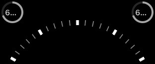
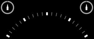
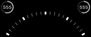
Tappd That ships an Apple Watch complication showing how many distinct beers you’ve consumed, along with a ring indicating how close you are to receiving your next distinct beer badge from Untappd. I recently ran into an appearance bug showing these values with the ring where they would be truncated with an ellipse. Originally, I had code to show an image if the value was four digits or larger, but that wasn’t enough. It looked pretty awful.

Unfortunately, Apple doesn’t publish the font size of the text in complications, and the font cannot be adjusted by the developer. Fortunately for you, I’m pretty good at trial and error, and I employed the (otherwise useless IMHO) time-travel feature to do some testing. You can measure the width of your font with boundingRectWithSize:options:attributes: and branch to display an image in your ring complication instead of text.
The good news is that the four-digits-or-larger trick seems to work for CLKComplicationTemplateModularSmallRingText and CLKComplicationTemplateCircularSmallRingText, as these rings are a bit larger. On CLKComplicationTemplateUtilitarianSmallRingText the maximum width before truncation appears to be 23.6 when measured with [UIFont preferredFontForTextStyle:UIFontTextStyleFootnote]. This was tested with watchOS 2 only.

As for the larger complications, I may update this blog post at some point, but I will leave those widths as an exercise to the reader. In my opinion, if you have something long displayed in these fairly wide complications, it’s likely something that was user-generated (e.g., an event name), and in that case, you do want the system provided truncation.
